Optimizing Solar Power Plant Performance.
UX design for SunEdison Connect application monitoring over 900 solar power plants across the globe.
I worked with SunEdison Global Operations team to redesign core application functionality to address pain points and improve usability.
I interviewed plant operations managers and researched usability challenges to improve navigation and data visual presentation.
I consolidated multiple separate app interfaces into one easy to use dashboard view showing overall performance view and diagnostics view.

I facilitated weekly meetings with SunEdison Connect operations and engineering team to review customer pain points and goals for improved functionality.
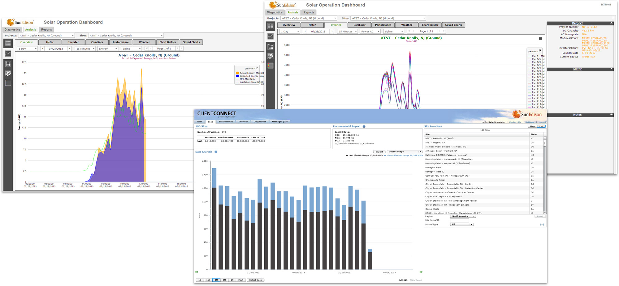
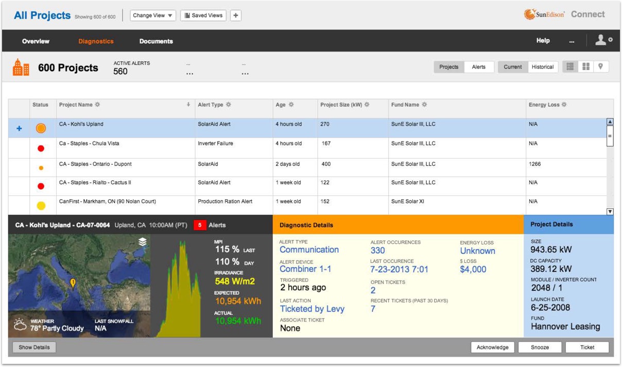
Original interface (before screen shown below) obscured important data making it difficult for plant operators to diagnosis problems and lacked an overview section for executive managers to identify and compare trends across regions and power plants.
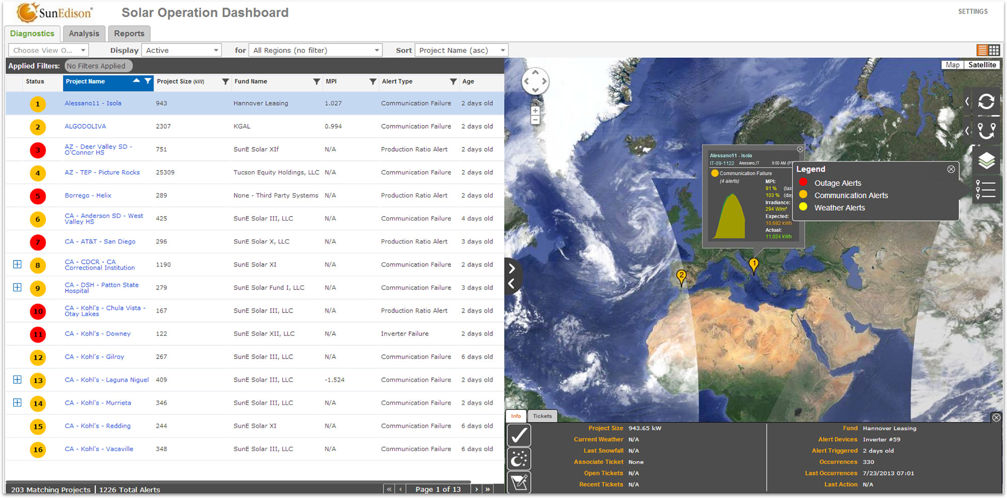
New diagnostics dashboard improved navigation, filtering and search. I organized critical information into a user-friendly, easy to scan format including metrics for comparing actual energy output versus expected output. Improved interface emphasized actionable steps such as initiating repair tickets. (My high fidelity wireframe shown below)
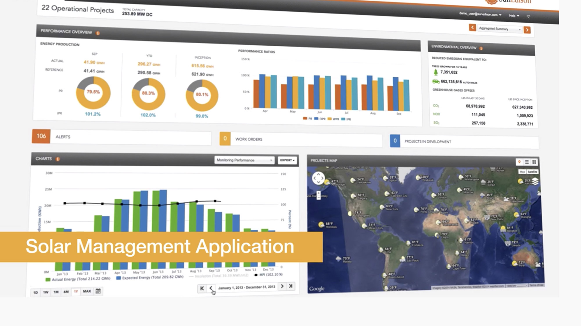
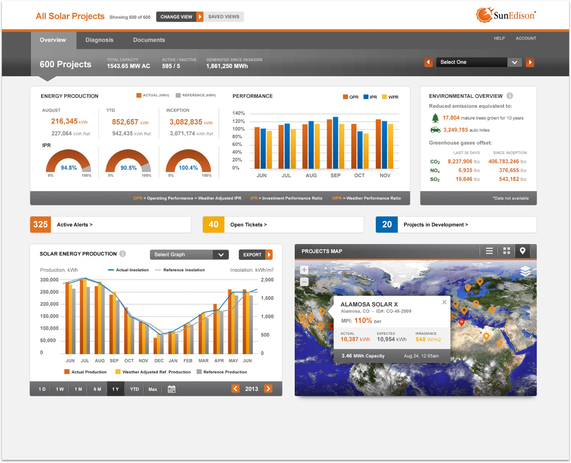
I designed new overview dashboard to improve visibility into power plant production. Managers were empowered to see system wide and regional trends, compare output over time, and see general status of tickets and alerts.
Result: SunEdison was able to transform multiple internal applications into one enterprise SaaS offering for energy managers, investors, and solar monitoring analysts. See Video